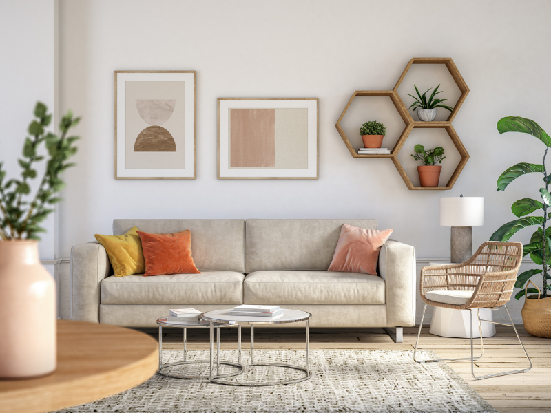
Embrace neutral colors
After a weary 2020, expect to see a return to prominence for nostalgic, neutral colors. The resurgence of neutrals signals a focus on simple comfort, healing, a return towards wellness, and is representative of a lifestyle with a slower pace. Colors to look for include oatmeal hues, cerulean and Aegean blues, and earthy tones.
Comforting colors
More than ever we are looking to our homes to provide us the chance to relax and recharge. Accordingly, serene, warm colors and soft pastels are making a strong comeback. They set the mood by providing a calm foundation, leaving room to add colorful decorations. Keep your eye out for rejuvenating colors including soft reds and creamy off-whites.
Add vibrance
To build upon your neutral palette, add touches of vibrant colors for an exciting contrast. This coming spring, you can expect to see nature-based hues on the rise. In 2021, these nature colors will reflect a return to vibrance after homeowners have spent most of 2020—and, in some places, remain—cooped up due to the COVID-19 pandemic. Colors to look for include rust tones and hues in the gold-to-orange range.
Color trends in your home
The calm, soothing presence of neutrals is best delivered when given ample space, so look to use the neutral palette on large surface areas. Good use cases in your home include painting whole walls, as well as furniture and carpeting choices. For vibrant colors, sprinkle them throughout the home in your décor and through smaller accents.
60-30-10 Rule
After you’ve chosen your colors, follow the 60-30-10 color design rule. It states that 60% of a room’s color should be the dominant color, 30% should be the secondary color, and 10% should be the accent color.
2021 Paint Colors
Here are three 2021 paint colors that will deliver the serene home environment you’re looking for while providing a solid foundation to add decorations.
Benjamin Moore’s 2021 color of the year is Aegean Teal. It combines a calming blue, a natural green, and a soothing grey. Its qualities make it a sound choice for bedroom or living room walls, as well as cabinets and other large surface areas. Aegean Teal is the perfect choice for homeowners looking to incorporate a bluish hue into their home without the melancholy undertones that come with blue.
Urbane Bronze
Say hello to Urbane Bronze—Sherwin Williams’ 2021 color of the year. Their selection is founded in the desire to create a sense of calm at home. Urbane Bronze helps to deliver the sense of a sanctuary at home, given its organic appeal. Use this color to give your home a relaxed feel by painting your trim or accent walls. Urbane Bronze pairs nicely with greys and modern greens.
Big Cypress
PPG has selected Big Cypress as part of their “Be Well” 2021 Palette of the Year. This ginger orange pairs well with cherry and mahogany woods, as well as touches of gold. Homeowners looking to create a soothing feeling without missing a sense of warmth can depend on Big Cypress to do the job. Another earthy tone, this color is the perfect choice to create what PPG calls a “huggable” room.
2020 has been a unique year, changing how we perceive and live in our homes. The new year presents an opportunity for a fresh start, so consider exploring these colors and trends to find the right combination for your home in 2021.
 Facebook
 X
X
 Pinterest
 Copy Link

